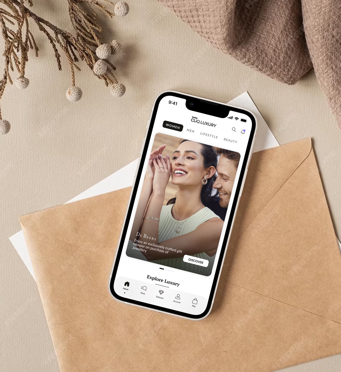
The biggest category had quietly stopped growing.
Watches was Tata CLiQ Luxury's biggest category, but growth had flattened. Most luxury buyers didn't prefer buying watches online. Then COVID changed the game. Watch sales surged, and our online sales overtook Ethos, India's most established luxury watch retailer.
The ask was a reskin. The solution wasn't.
The business ask: redesign the watch PLP and PDP so we can sell more, and higher-value, watches. The signals behind it: a low PLP-to-PDP rate and high exit rates, add-to-cart and conversion below the platform average, and 80% of marketing campaigns driving traffic to curated PLPs or PDPs.
What I proposed instead: a research-led redesign of the buying experience, not a visual refresh.
With no Head of Design above me, I made the case to the product head for full research and creative authority. Then I asked the harder question first: why don't luxury buyers prefer buying watches online?
Three stakeholders, three definitions of "good".
 Customers
Wanted reliability
An easy, reliable way to discover brands, with enough information to trust a high-ticket decision.
 The business
Wanted growth and conversion
Lower acquisition cost, more conversion, and visitors who returned as long-term buyers.
 Luxury brands
Wanted trust and expertise
To reach new customers without diluting brand value or sitting beside lower-value labels.
None of these were the same problem, and none could be solved with just a reskin.
A 45-day research plan built around three areas.
- Why do people buy luxury watches?Inspirations, drivers, motivation, emotion.
- How do they buy watches today?Preference, location, experience, decision-making.
- What's missing in the online experience?Expectations, unmet needs, opportunities and shortcomings.
We created demographic and psychographic profiles and identified 20 buyers across varied user groups, sourced through the watch sales team's own client networks. I led the interviews personally.
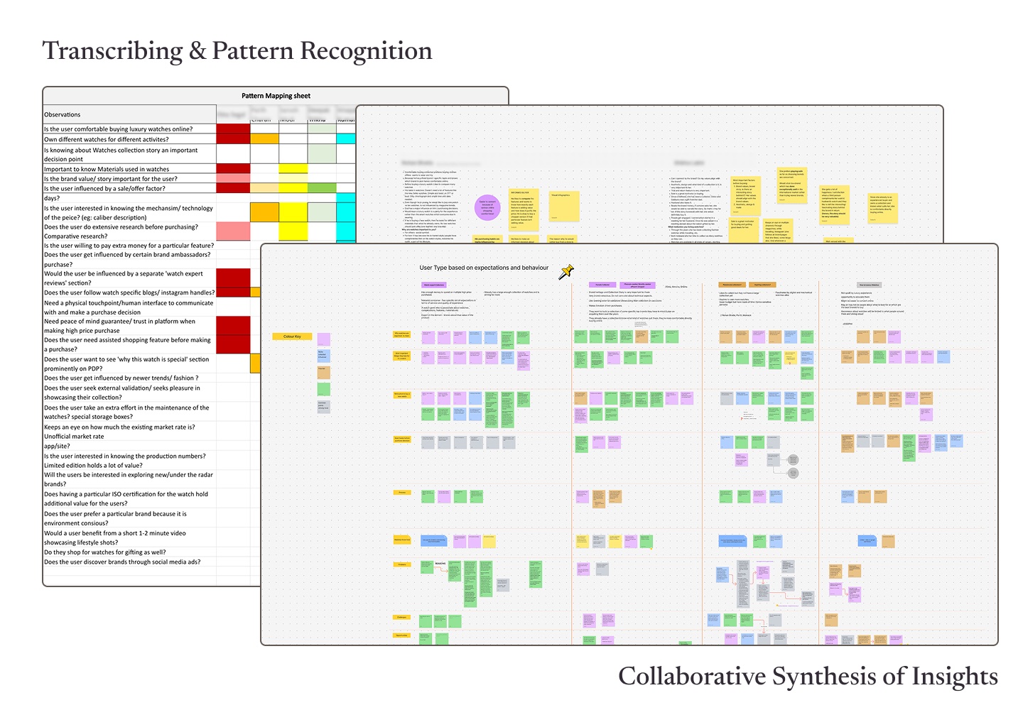
Synthesis, done in the open.
I brought people from Sales, Business, Customer Service and Product to sit inside the research, not just read a summary about it. Pattern-mapping and synthesis became collaborative workshops. That's where empathy and buy-in started, long before a single screen was designed.
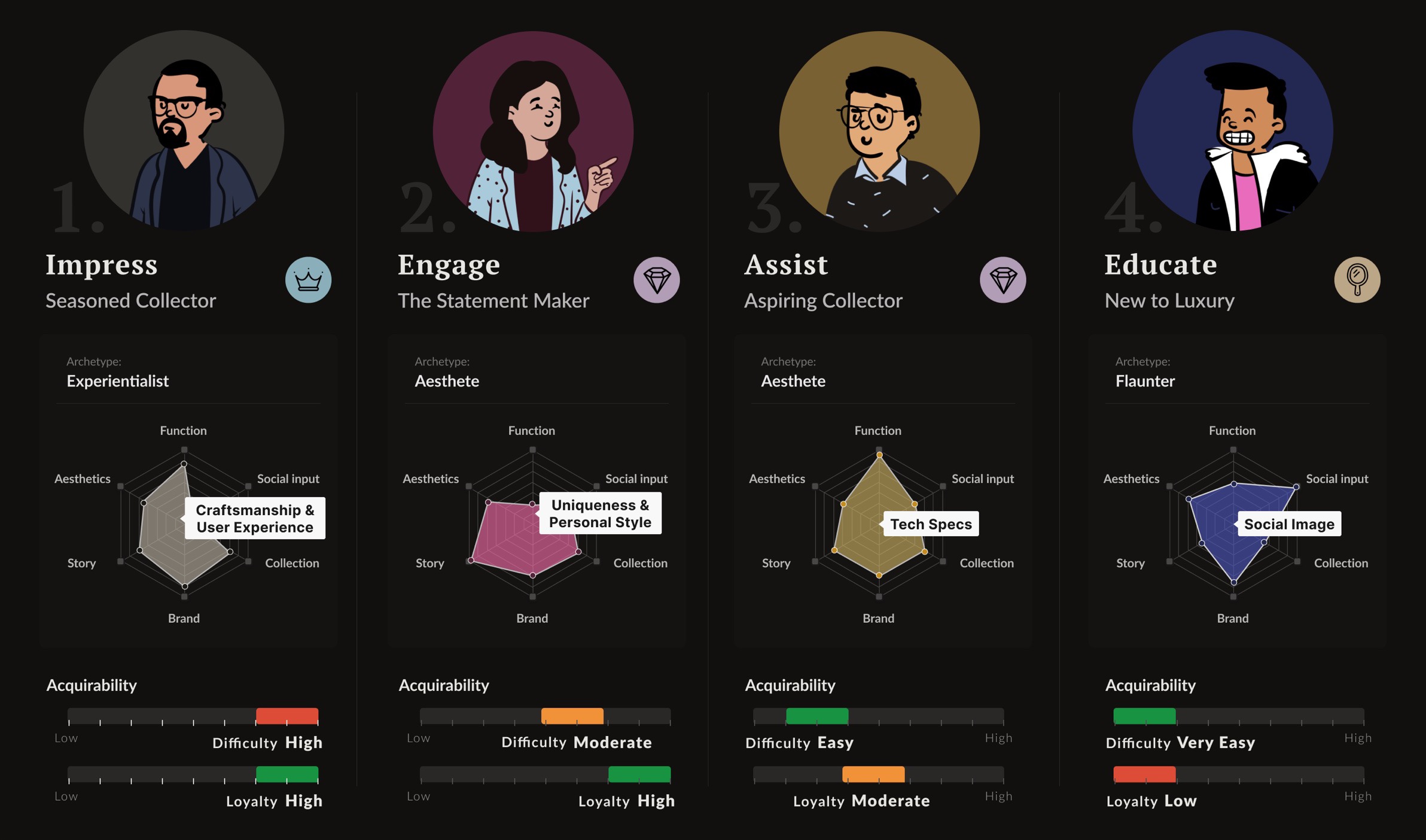
Three ways people love luxury.
 The Aesthete
Values unique aesthetic and craftsmanship. Prizes exclusivity and personal taste. Sees the product as an extension of who they are.
 The Experientialist
Values a brand through lived experience of it. Loves the ritual and attention of buying luxury. Will pay a premium for experiences with unique value.
 The Flaunter
Values the brand's standing in society. Loyal to a brand while it is trending. Influenced by social circle, ads and creators.
Consolidated, actionable personas.
People were buying the story they'd get to tell.
The watch mattered. The craftsmanship, the mechanism, the object itself, all real. But what decided which watch someone bought was not the specs. It was what the watch meant: the heritage behind it, the story they'd get to tell, what it said about where they'd arrived in life. It's the entire architecture of the buying decision.
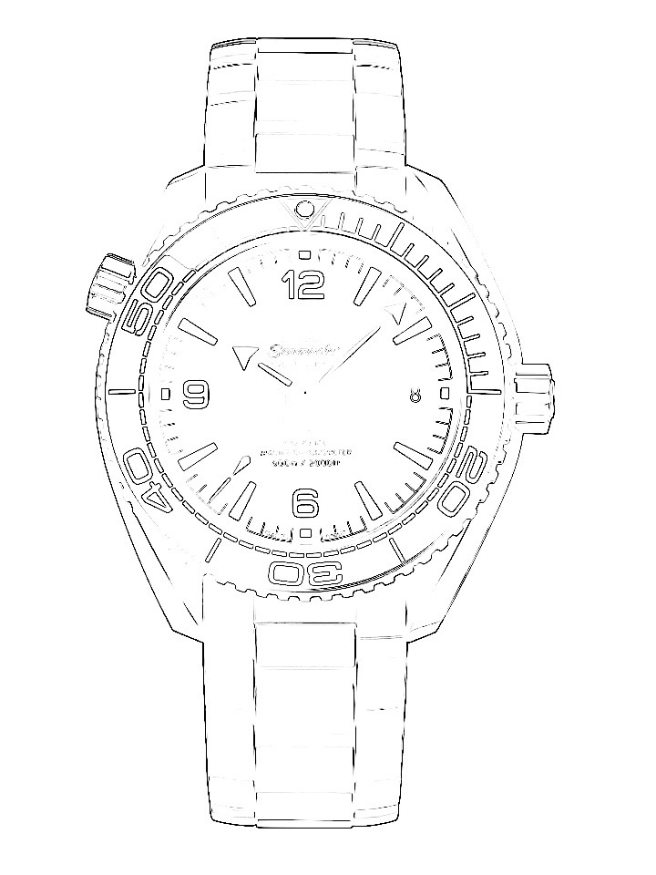
What the page described
- Case diameter
- Movement
- Crystal
- Water resistance
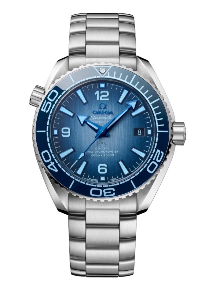
What people were buying
- A maison's heritage
- The story they'll get to tell
- Where they've arrived in life
- Who they're becoming
This insight held true beyond watches. Every category where aspiration drives choice has a story underneath it.
Our product had gaps. So did our understanding of people.
Product design gaps
- Hard to explore
- Discovering brands and collections wasn't intuitive.
- Weak search and filters
- Finding watches by attribute or feature was limited.
- Limited information
- Detail needed to compare a high-ticket buy was missing.
Psychological consumer needs
- Communicating value
- Owning something rare that makes a statement matters.
- Personal attention and guidance
- Buyers expect curation and expert aid, as they get offline.
- The aspirational buyer
- New-money buyers want to belong, and to be educated.
If people buy stories, every touchpoint has to tell one.
Stories became the spine of the design, a more conversational journey at every step: home, category, listing, product page, editorial. Not content bolted on at the end. It was the core principle every screen was designed around.
How might we empower each kind of buyer to find the right watch and own it with confidence?
 The seasoned collector
 The statement maker
 The aspiring collector
 New to luxury
Make people feel what it means to own the watch before they buy it.
Help every persona find their watch, from connoisseur to newcomer.
Build content that rewards curiosity and grows category knowledge.
Be credible enough that luxury brands trust us with their story.
Exploring unique, engaging ways to tell stories.
No restrictions, no early critique. The team explored freely, and the best ideas in the final design started here.
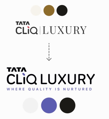
Tata CLiQ Luxury went through a complete rebrand in the middle of this project.
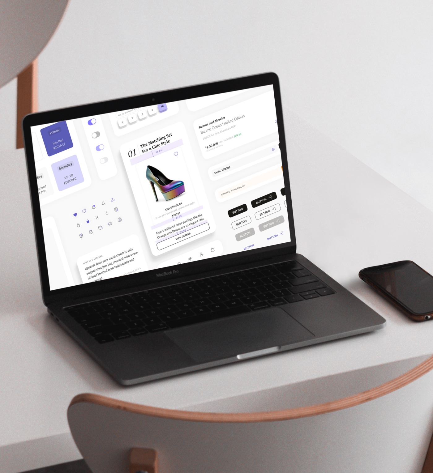
Mid-project, the business rebranded under us. Months of work aged overnight. I kept the team steady, then reframed the setback: instead of retrofitting old screens, we'd build the new UI language and design system from scratch, in Figma.
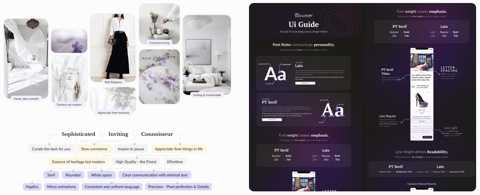
The rebrand was positioned around "slow commerce": the modern version of luxury, approachable and unhurried. Serif warmth, generous white space, micro-animation. Every rule traced back to that idea.
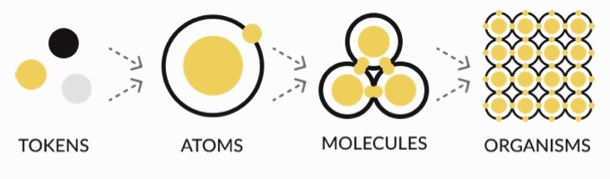
Built for one project. Designed to become the standard for three businesses.
Emotion, specified down to the line-height.
Restraint is easy to describe and hard to enforce. Every rule was documented so any team could apply the same one.
Curious how the system was built? Read the design system case study →
Designing for slow commerce: giving the product room to breathe.
Try both yourself.
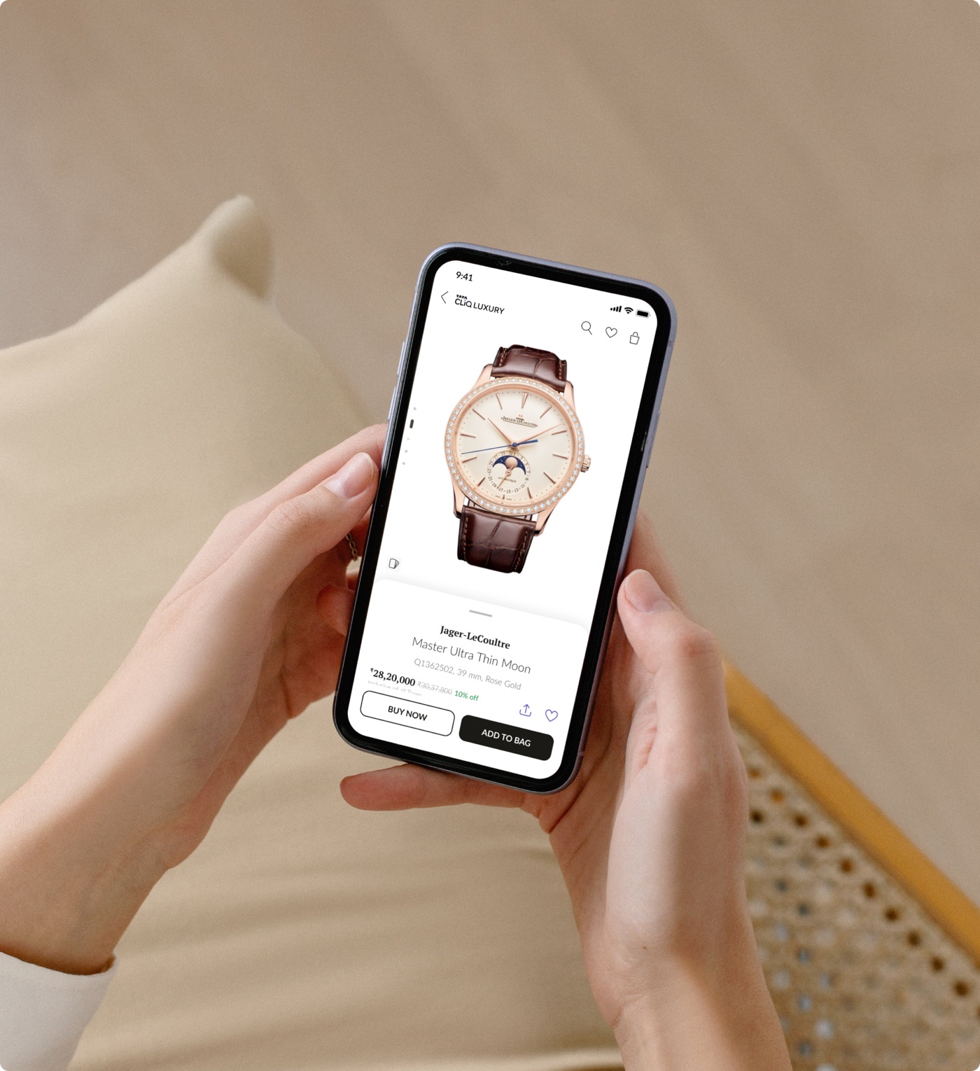
The same watch, the old product page and the new one. Tap through each to feel the difference.
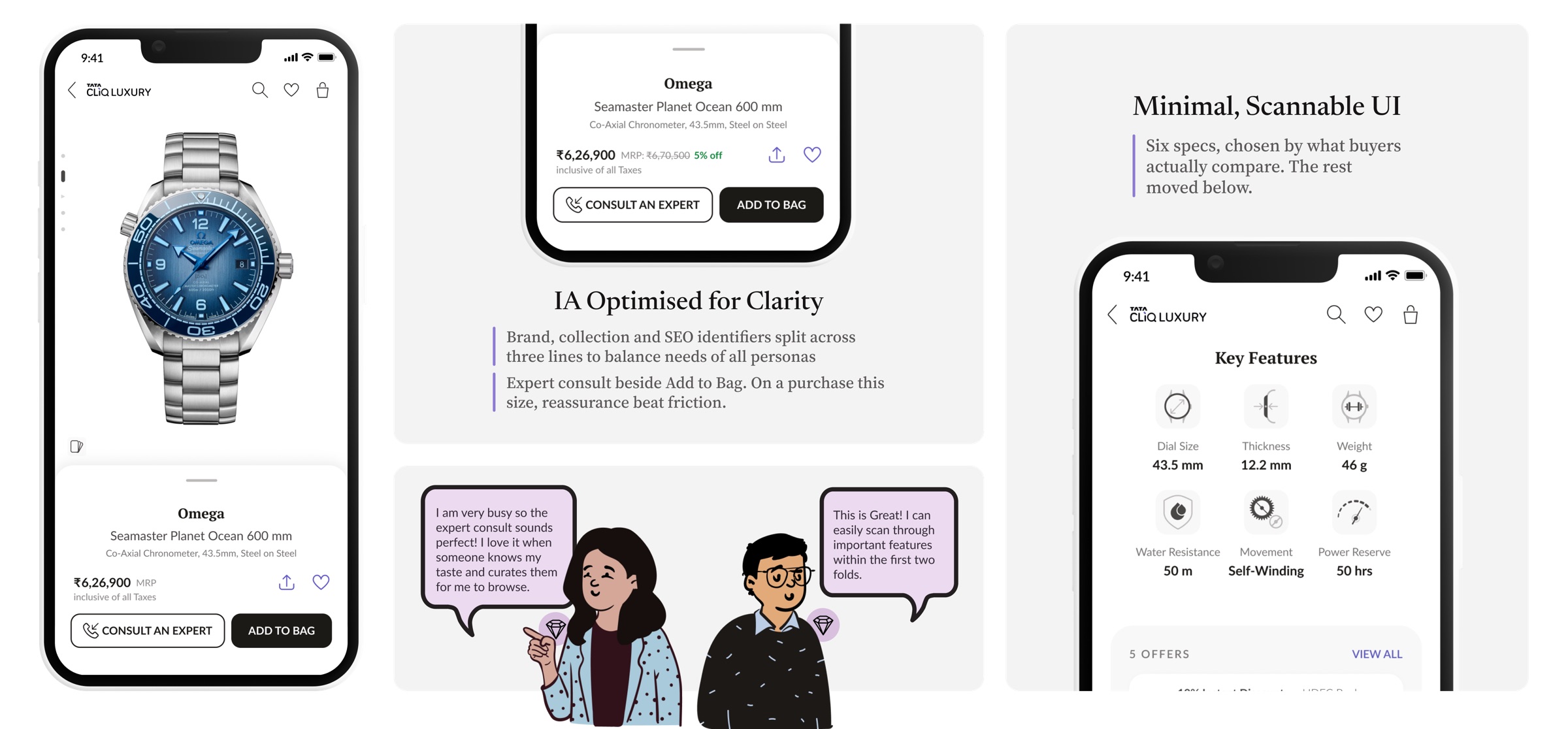
Key features, legible at a glance.
- Minimal, scannable UI. Six specs, chosen by what buyers actually compare. The rest moved below.
- IA optimised for clarity. Brand, collection and SEO identifiers split across three lines to balance the needs of all personas.
- Expert consult beside Add to Bag. On a purchase this size, reassurance beat friction.
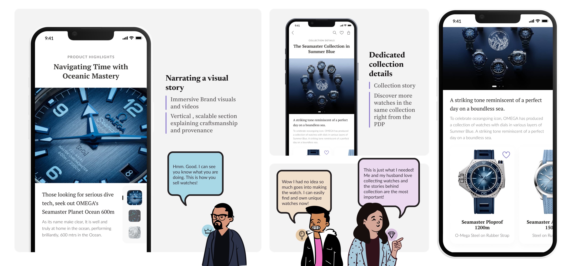
Letting the watch tell its own story.
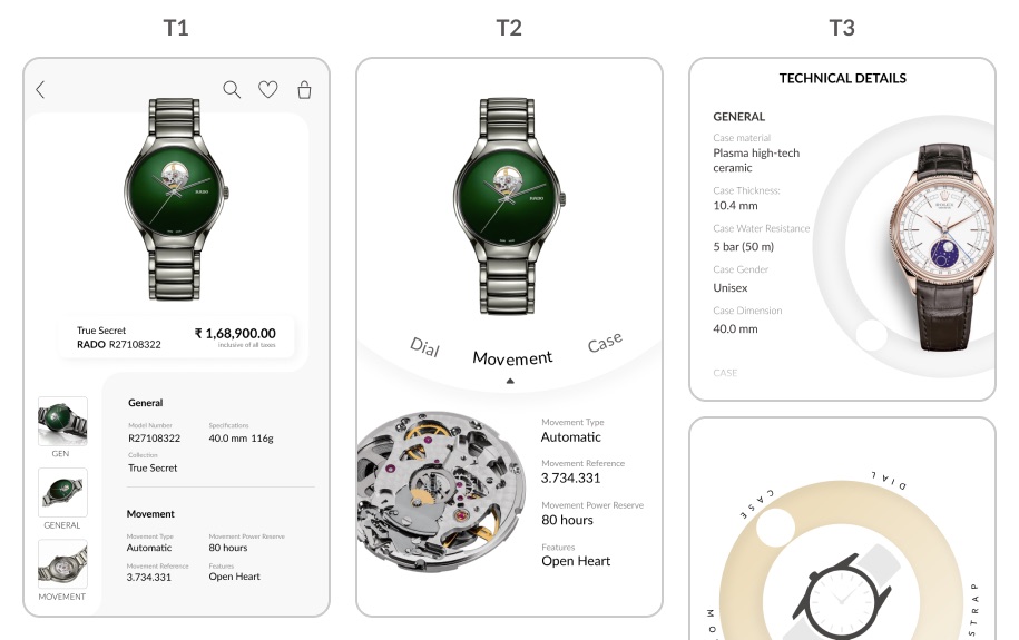
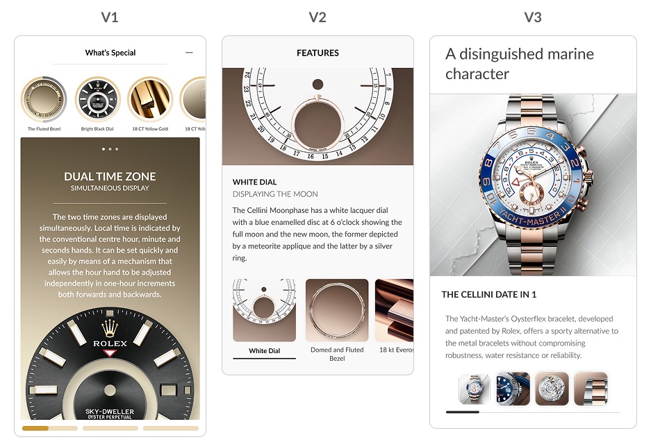
- Narrating a visual story. Immersive brand visuals and videos, and a vertical, scalable section explaining craftsmanship and provenance.
- Dedicated collection details. The collection's story, and more watches from the same collection, right from the PDP.
Making complexity legible.
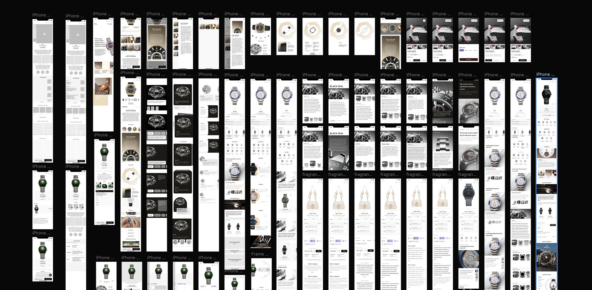
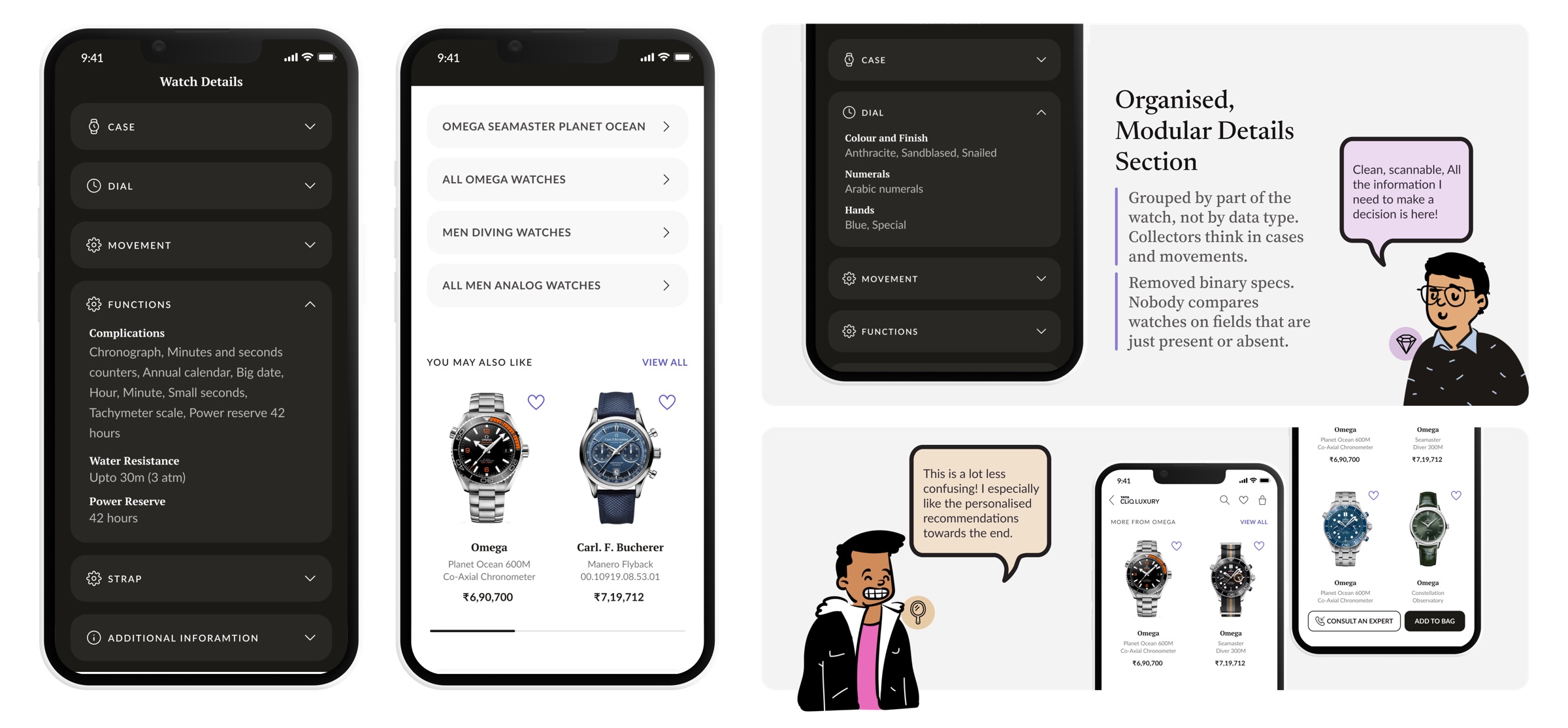
- Organised, modular details section. Grouped by part of the watch, not by data type. Collectors think in cases and movements.
- Removed binary specs. Nobody compares watches on fields that are just present or absent.
Browsing, rebuilt around the buyer's concerns.
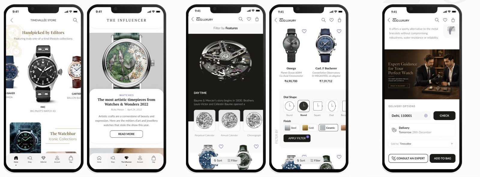
- Story entry points. Collection and editorial hooks that reward curiosity while browsing.
- Progressive filters. Movement, material, complication: the vocabulary collectors think in.
- Trust signals. Authenticity and expert-consult cues that make a high-ticket buy feel safe.
One insight, many surfaces.
The same finding, that buyers buy a story, shaped a whole family of work beyond the two pages I was originally asked to fix.
Watch events
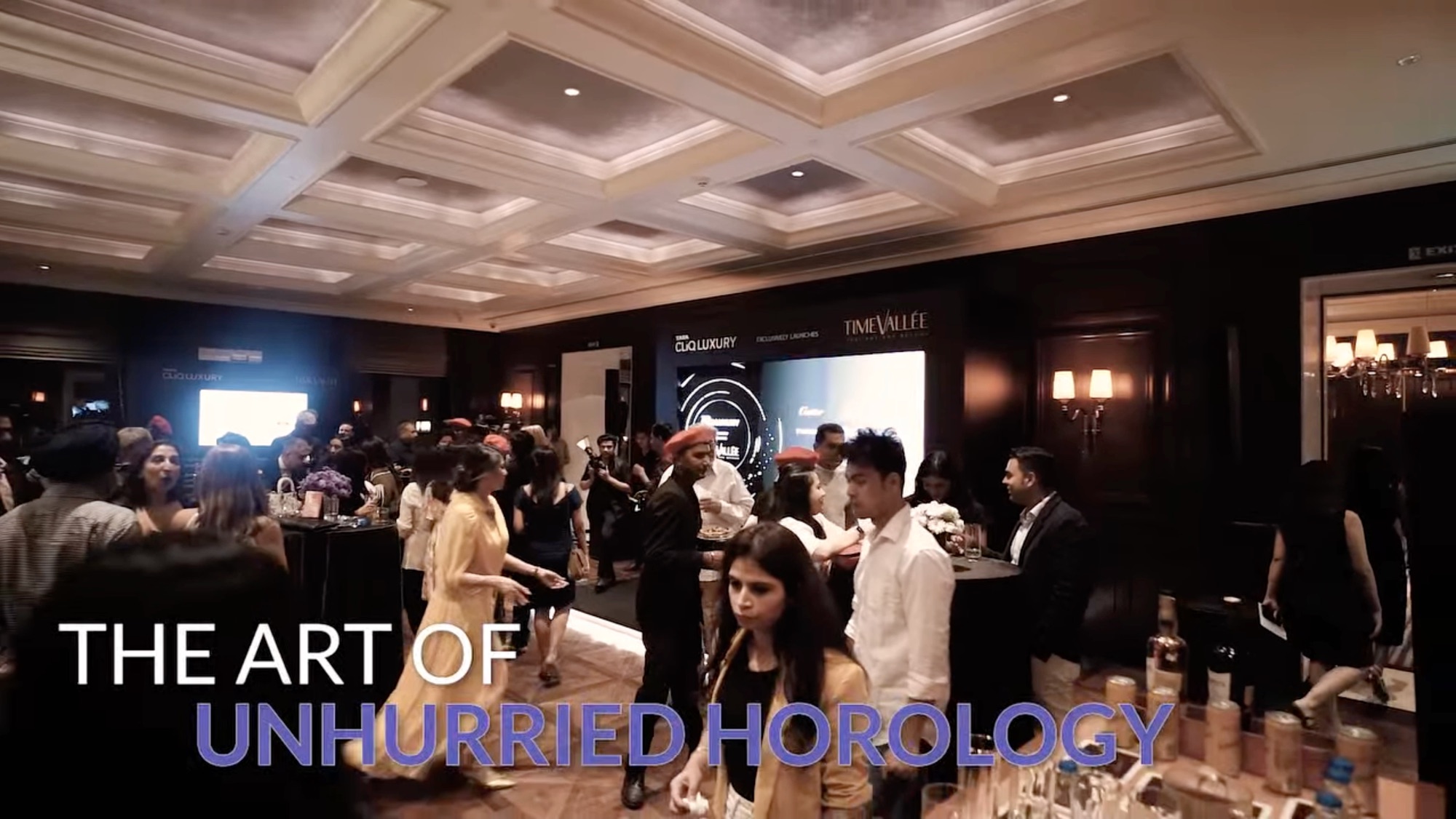
Bringing the ritual and expert attention buyers valued offline into curated evenings, where the story around the watch could be felt in person.
Editorial tab
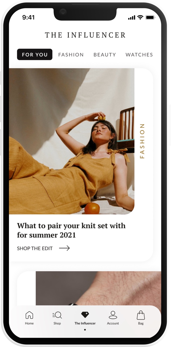
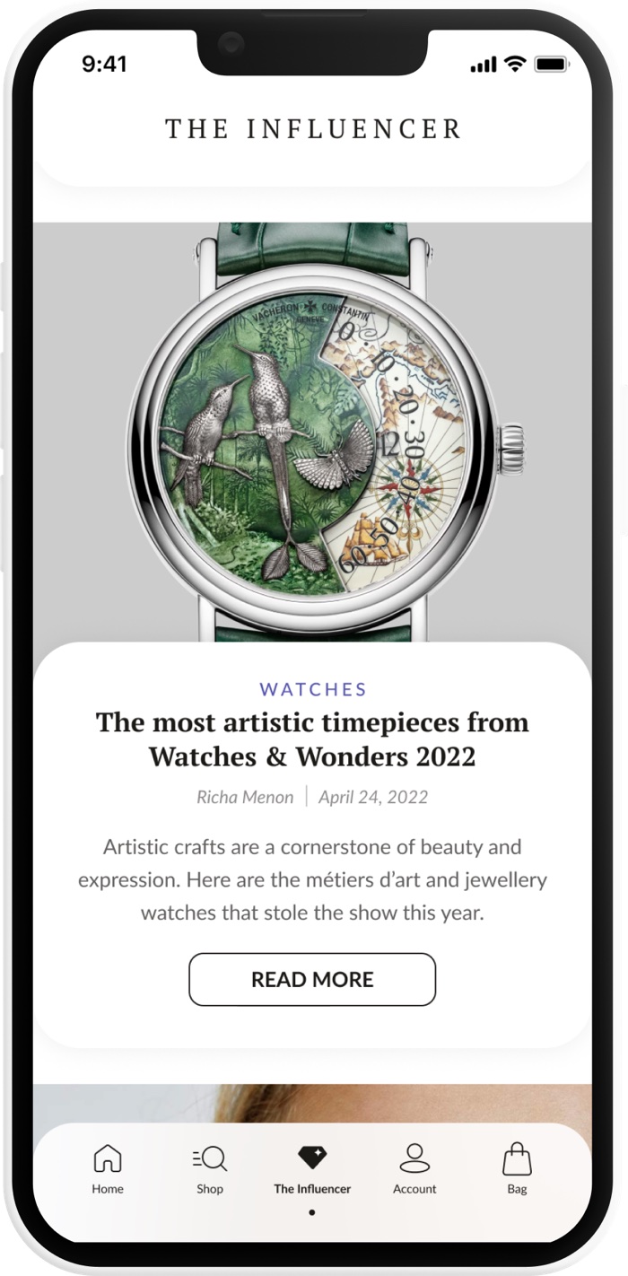
Content that educates the aspirational buyer and rewards the connoisseur's curiosity, organised by interest, with watches as one of the worlds to explore.
Brand flagships
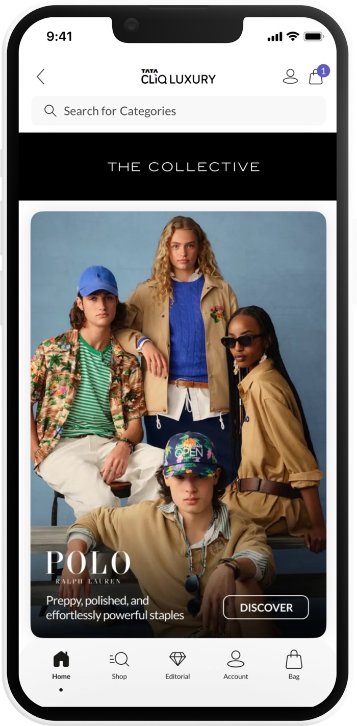
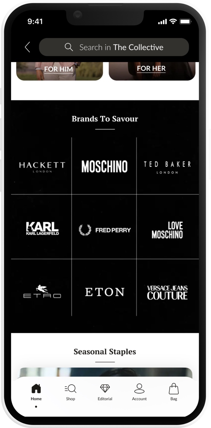
Immersive houses for TimeVallée, Le Mill and CAPSUL, each telling its own story on the platform instead of sitting in a grid of products.
Watch Society
A community programme for collectors. We turned the social side of owning a watch into something the platform could actually offer.
Credible enough that Richemont trusted it.
Richemont audits every pixel before it lends a maison's name. After this redesign, TimeVallée made the platform its exclusive Indian partner, bringing Cartier, IWC Schaffhausen, Jaeger-LeCoultre, Panerai, Piaget and Roger Dubuis online in India for the first time. The experience was the pitch.
What shipped, and what didn't.
Shipped
- Redesigned PDP and attribute-based PLP
- Luxury design system, now 500+ components
- Homepage and editorial tab
- Brand pages: TimeVallée, Le Mill, CAPSUL
- Watch Society community launch
Deprioritised
- Full watch comparison tools
- AR try-on for watches
- Personalised pathways per archetype
- Complete journey-architecture vision
Cut for technical and organisational timelines.
How I led: clarity over hierarchy.
I find the problem worth solving.
Briefs arrive as solutions. I go back to the question underneath before committing a team to anything. On watches, that meant asking why buyers avoided the category at all, not just why two pages underperformed.
I hold direction when conditions change.
Rebrands, timelines, shifting priorities. My job is to protect the thinking, not the artefacts, so the team knows which parts are load-bearing and which can be rebuilt.
I build for whoever comes next.
Systems, documentation, research anyone can use. If the work only functions while I'm in the room, I haven't finished it.
What I'd carry into the next brief.
People don't buy things. They buy belonging.
Watches taught me that. I'd like to find out what your products would teach me.