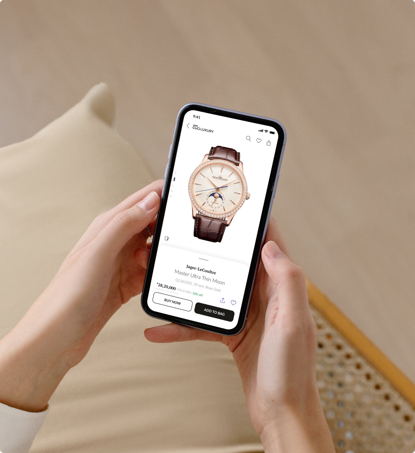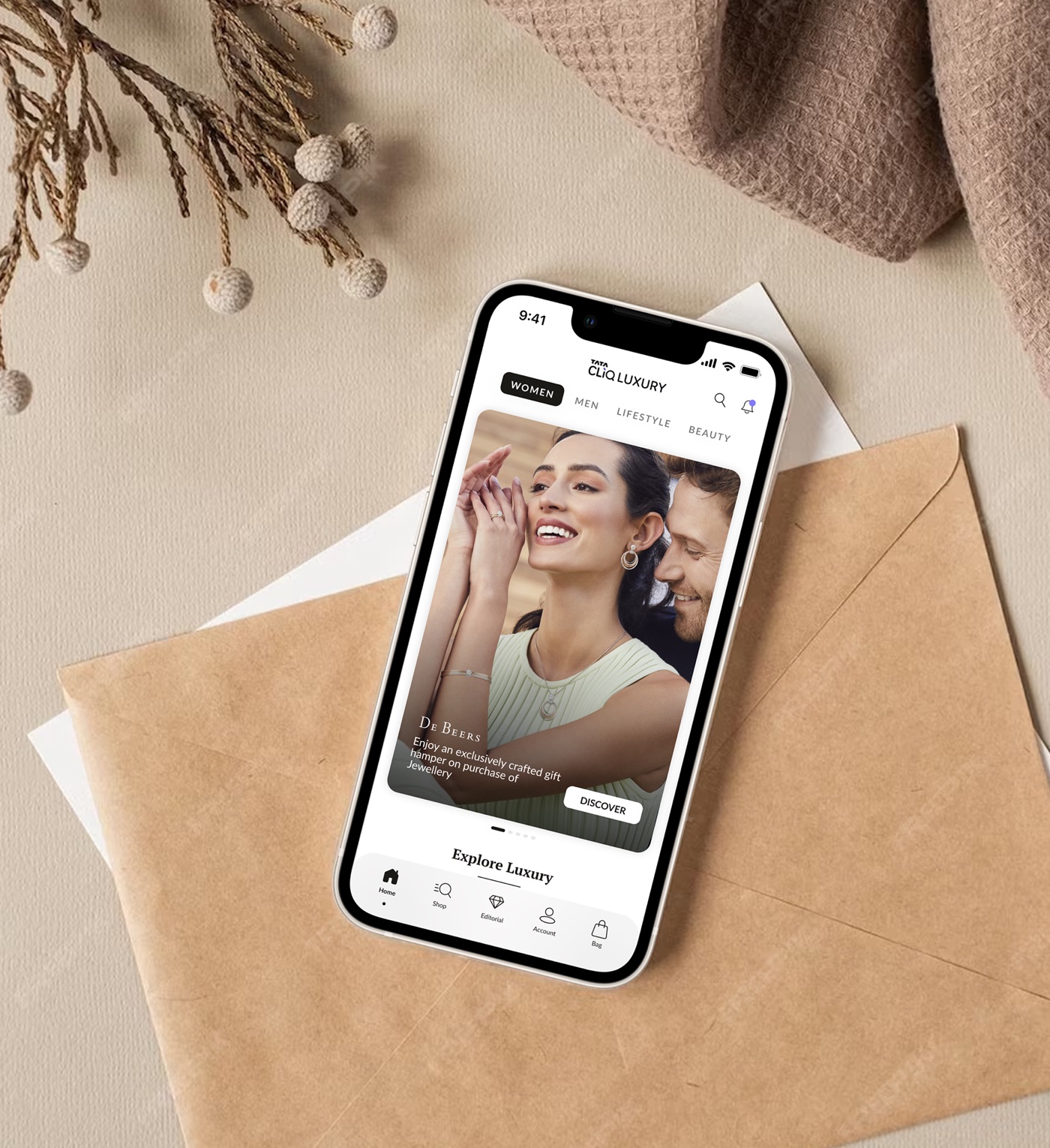
A homepage that couldn't keep up with the business.
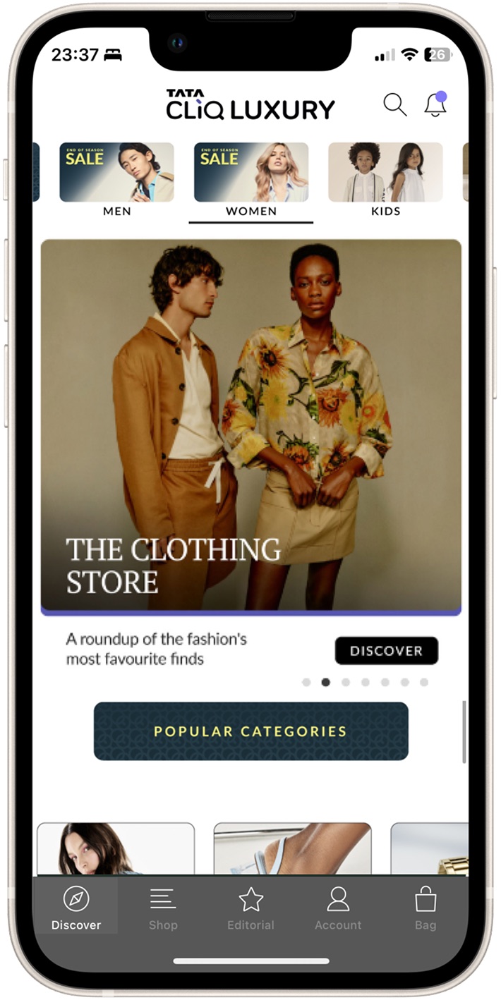
Tata CLiQ Luxury is India's largest and most trusted luxury ecommerce platform. It had grown quickly, but its homepage wasn't built for the range of offerings it now had to carry. Each new offering became another row. The page grew longer, and click-through fell steadily down its length.
My role was to set the vision for a world-class luxury homepage and deliver it: one that drives engagement, tells brand stories and improves conversion.
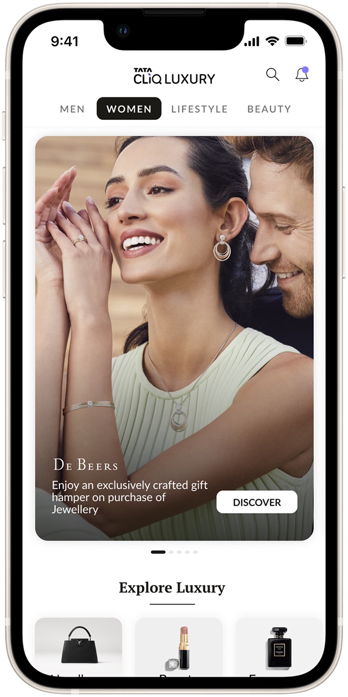
Bringing focus to a vast, open-ended brief.
Business, marketing and creative teams each came with their own requirements and their own constraints. Over many working sessions with all of them, we identified one core problem for each group.
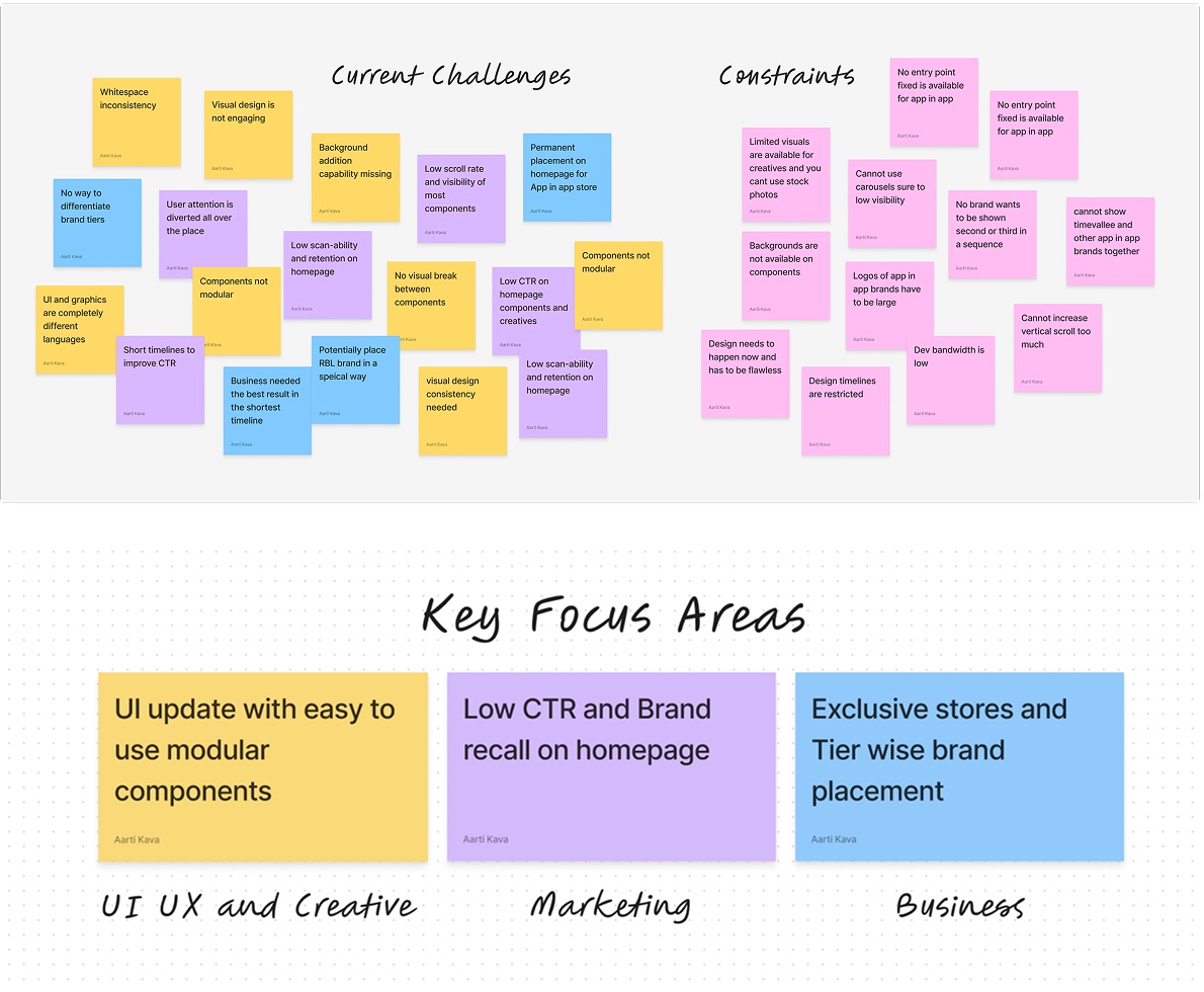
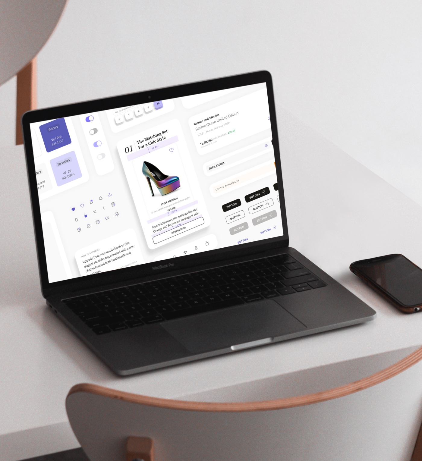
- Design modular components with function and flexibility in mindNew components had to flex with changing business and marketing needs and adapt to graphic themes, without frequent design or development work.
- Improve engagement on the homepageLow click-through below the second fold showed the content wasn't being presented well.
- Increase visibility for exclusive global brand storesThe app's exclusive international brand stores were hard to find and needed a proper showcase.
40% of taps went to one choice: men or women.
A quick heuristic evaluation, confirmed with Omniture analytics and attention mapping, showed where attention went and where it didn't.
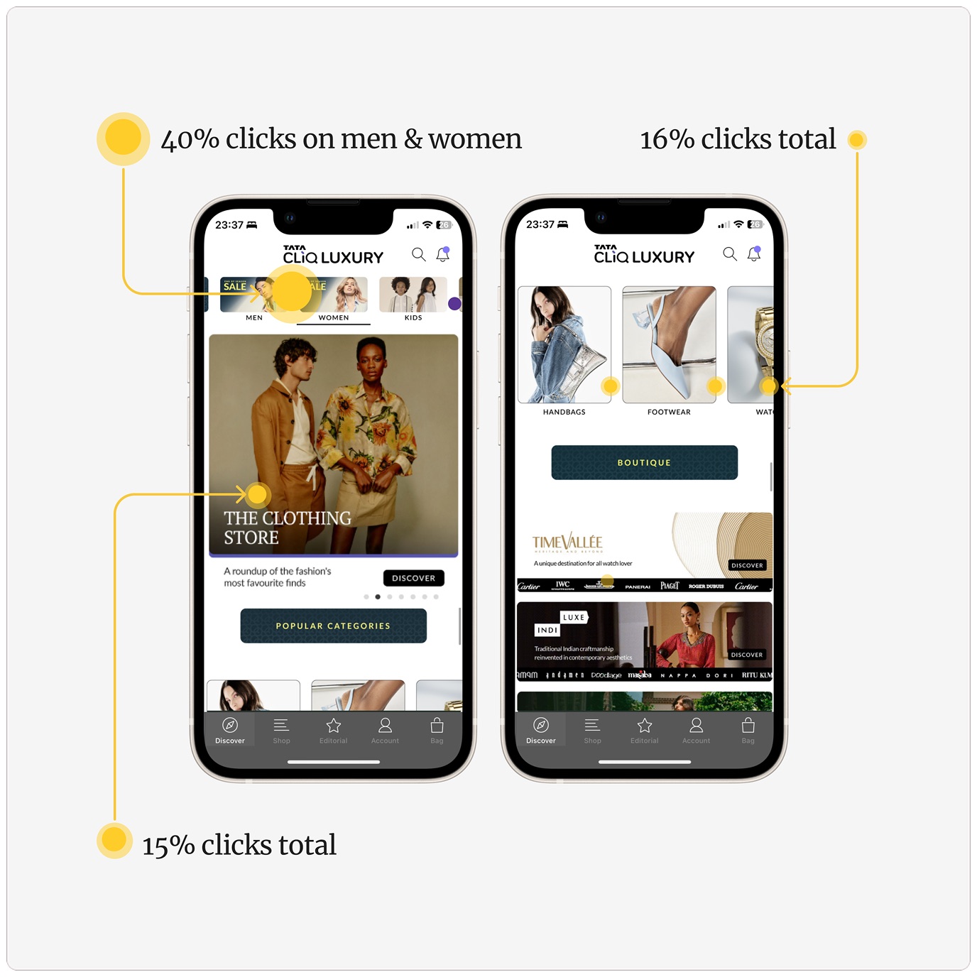
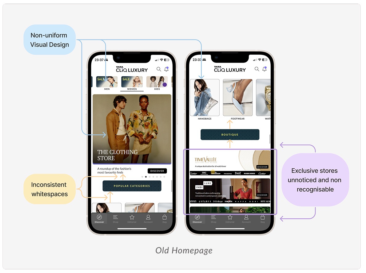
- 40% of clicks went to the Men and Women quick linksPeople wanted to filter what they saw by gender right at the start of their journey.
- 16% went to brand-focused hero bannersPeople were sometimes curious about what their favourite brands had on offer.
- 15% went to the popular categories carouselPeople valued a quick, easy route to the categories they were looking for.
We split one vague brief into three problems, and solved them in parallel.
To make the scope manageable, I broke it into focused pieces the team could explore in parallel:
Visibility for app-in-app stores
Give the exclusive brand stores a place to shine without crowding the page.
Homepage engagement
Make the first two folds do the work the whole page used to attempt.
Structure & components
A modular system the business can refresh without design or dev help.
Giving the exclusive brand stores a place to shine.
We went through many explorations as a team, then ran feedback sessions with stakeholders. That made the limits the business and creative teams faced much clearer. Working with them continuously got us to a solution that worked for everyone.
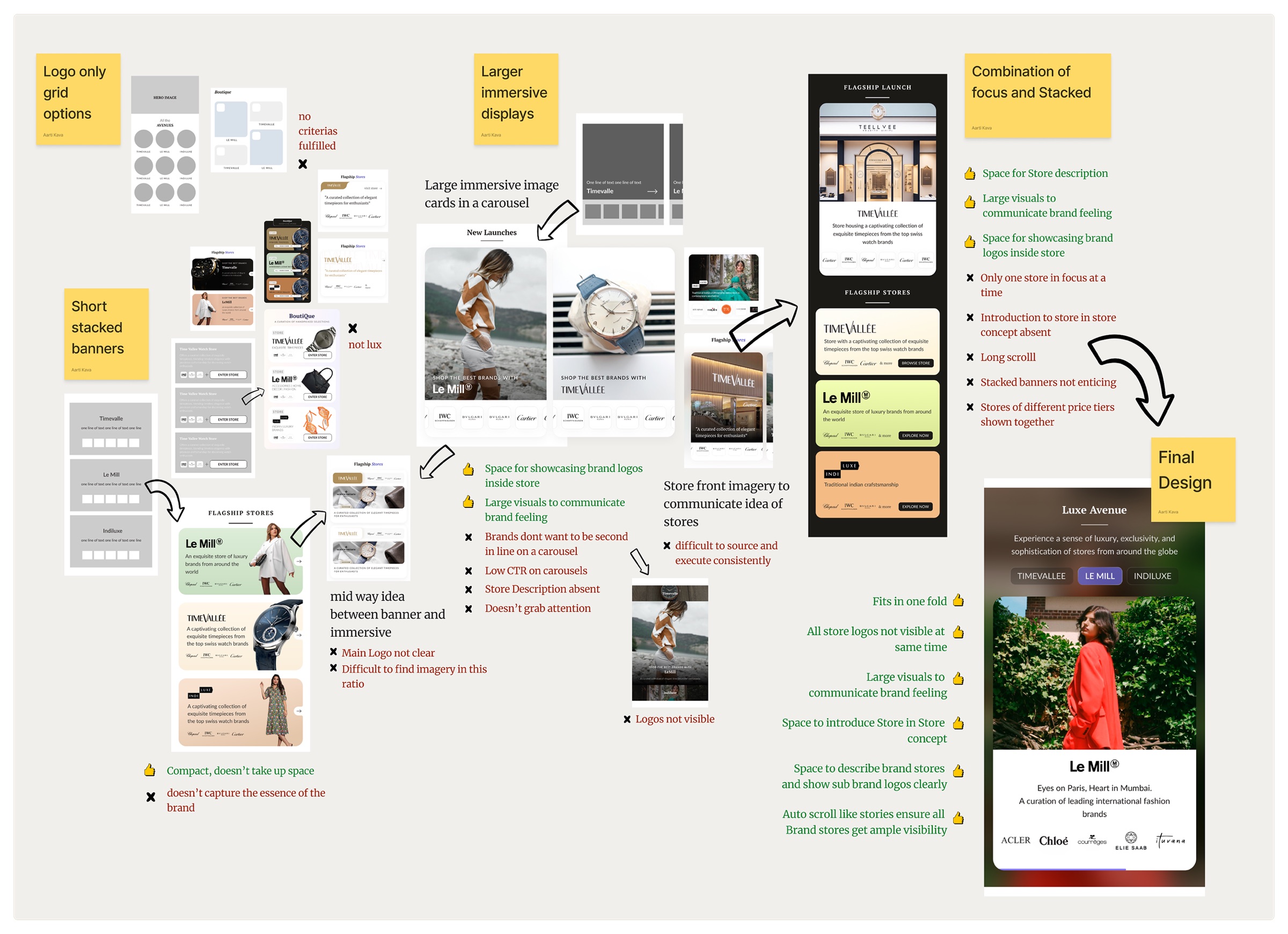
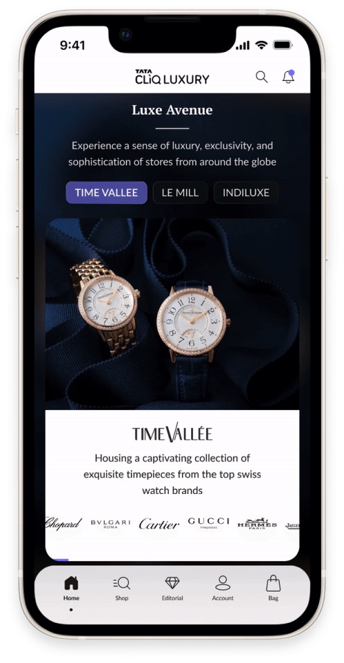
An immersive showcase for the exclusive global brand stores.
The design addressed every constraint the business raised, and the brands themselves received it very well.
- It solved store adjacency and put sub-brands in focusOne immersive component brought attention to the exclusive stores and the brands inside them, and solved tier-wise placement.
- Timed auto-transitions kept every store visibleStore details sit behind tabs, but story-like timing meant discoverability didn't suffer.
- Engagement rose 300%A permanent focal spot on the third fold put far more eyes on our flagship brand stores.
Relevance first, then everything else.
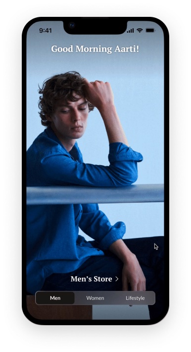
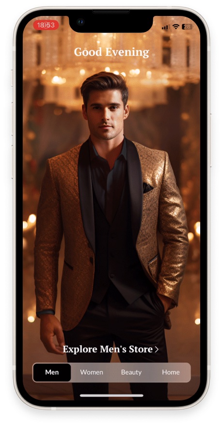
Insight. People wanted relevant content from the start, which the gender choice at the top of the journey showed clearly.
Idea. Ask people what they're looking for on first launch. It gives them relevance while keeping business offerings visible.
Experience. On first launch, the landing page cycles through three or four store pages, each leading to a curated homepage. Whichever one a person chooses becomes their default, and future launches take them straight there. They can switch anytime from anywhere on the homepage. Only the gender homepages become defaults, so the full business offering stays visible.
Engaging, dynamic, modular, and easy to refresh.
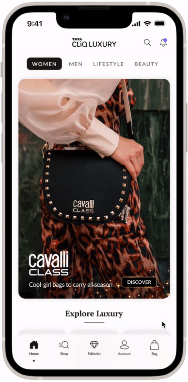
- Everything important within the first two foldsSwitching between contextual homepages, catching up with favourite brands, and reaching every product category, all without scrolling far.
- Modular component designFlexible enough for the creative team to use themes and occasions fully, and simple enough for teams to update without errors.
- New ways to group and showcase brandsComponents that let business teams cluster brands from different tiers and show them in distinct ways.
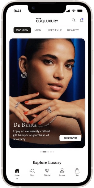
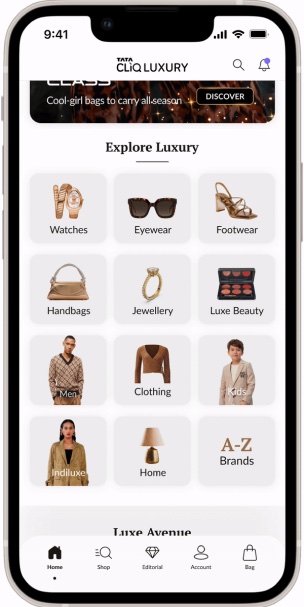
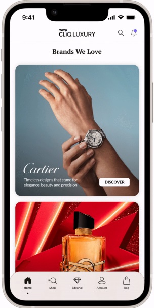
Communicating guidelines for better execution.
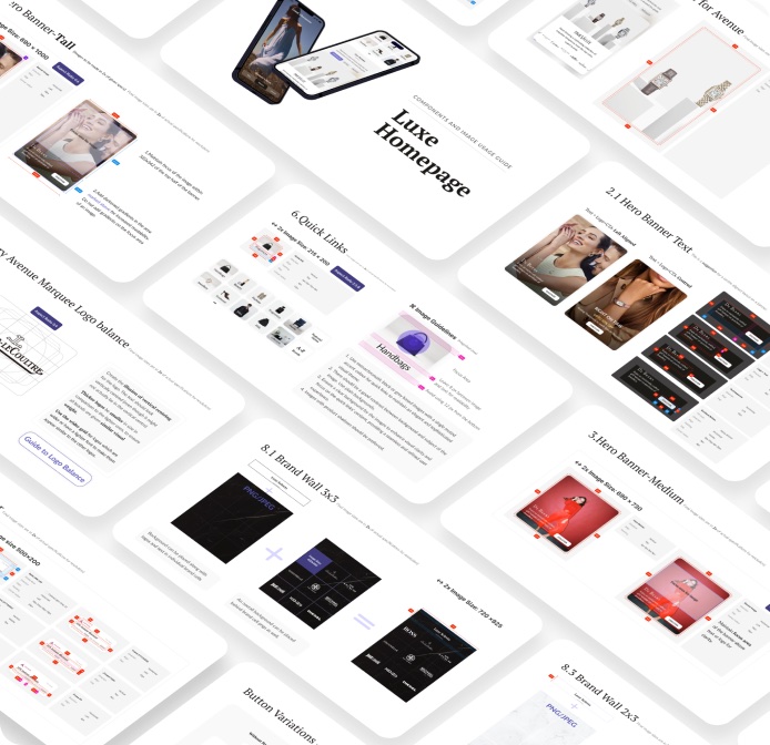
My role didn't end at the design handoff. The new design only works if the teams running it every day understand what it makes possible, so execution and daily updates need to be as smooth as the design.
Alongside several knowledge-transfer sessions, we created an export specs document with every component detail. Creative, category, content and merchandising teams all worked from one source of truth.
Key results and learnings.
Active data tracking and stakeholder management were critical to our success.
The project brought together teams and functions that hadn't worked closely before, and built real collaboration between them. We tracked data early, ran usability tests with a control group and watched behaviour trends. That let us act quickly and head off problems early in the launch.
Page views per visit also fell by 10%, alongside the rise in listing views and conversion.
Key contributions
- Aarti Kava: Project lead, UX & UI design
- Anaya Purandare: UI design & documentation
- Aryan Kandhari: UX research & UI design