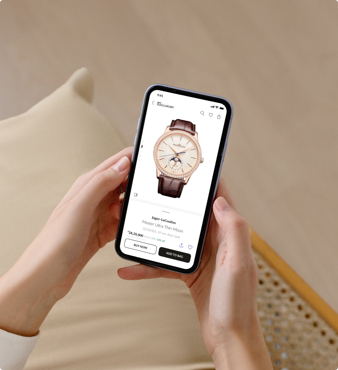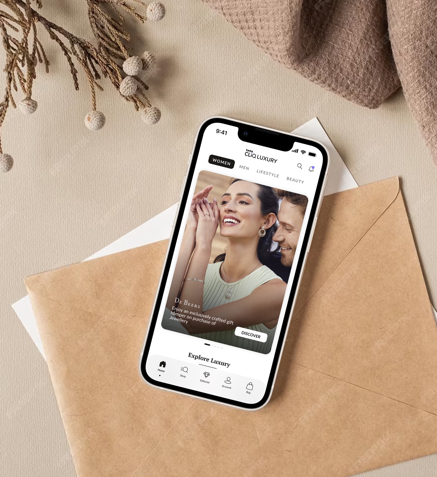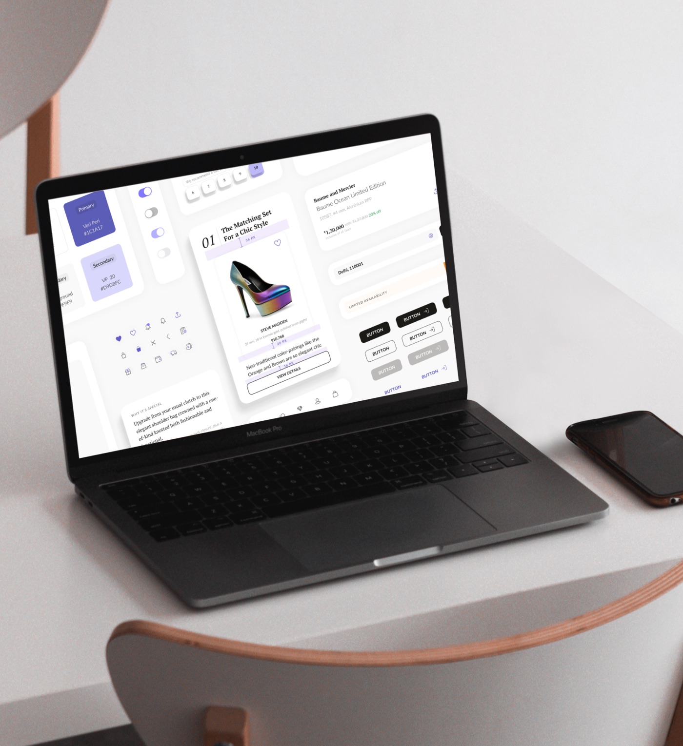
Where it started: the system was first built for the luxury watches redesign. See it in context →
Unifying a diverse design landscape.
I led a team of two designers through creating and documenting a complete design system for Tata CLiQ Luxury. The aim was to unify a scattered design landscape and change how luxury is perceived in digital spaces. Three things made it hard, and they all happened at once.
1. Sketch to Figma
The design landscape had moved on, and every file had to migrate to Figma.
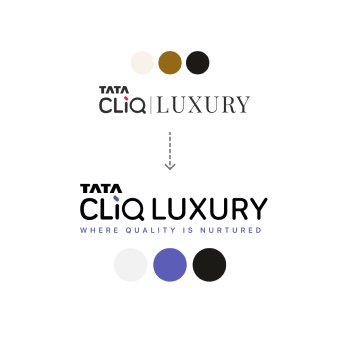
2. A branding overhaul
The brand was redesigned to keep pace with a changing Indian luxury consumer.
3. Resources vs vision
We needed a system urgently, but the product work couldn't stop while we built it.
A plan a team of three could actually keep.
The beginning was slow. I had to plan it so that three designers, including me, could keep developing the product and still find time to build a new system and UI language.
I laid out a strategy and roadmap for building the foundation and working toward the long-term vision.
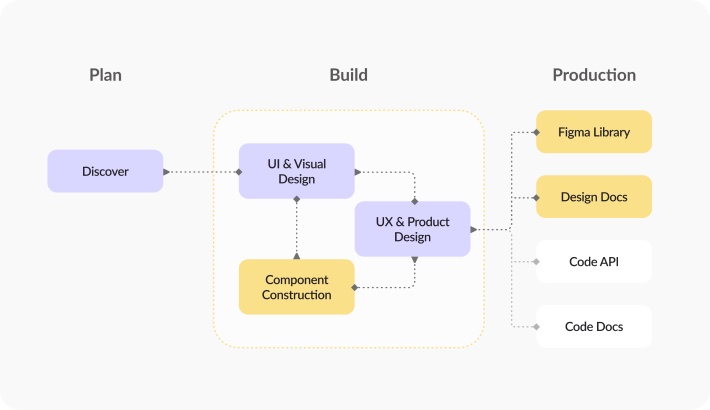
Fig. 1 · Nine months, three phases, running alongside live production projects.
Taking a pause.
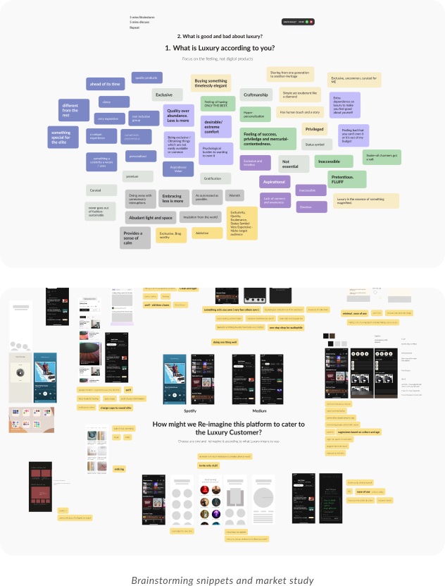
Before designing a single component, we worked out what luxury should mean in a digital space, together.
- What luxury means to each of usI ran brainstorming sessions with the whole team to surface our shared perceptions of luxury, good and bad.
- Everyday apps, reimagined as luxuryI asked the team to redesign two non-ecommerce apps as our own version of luxury. The fundamentals we found carried straight into the design language.
- Market insightsResearch across luxury brands showed us how luxury is being redefined today.
Turning "slow commerce" into rules a team could follow.
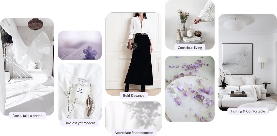
The new brand was built around one idea: slow commerce. It encourages people to appreciate the finer moments in life and make mindful choices. For an ecommerce platform, that meant not rushing anyone into an impulse buy, and helping them find things that inspire and delight them at their own pace.
Not rushing people is a design decision. So is every pixel that follows it.
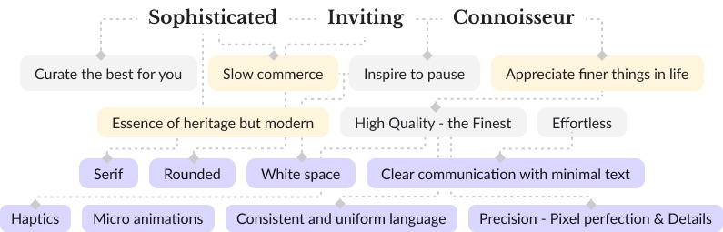
Together we pinned down what made the identity feel the way it should. Deliberate white space. Rounded corners for warmth. A palette of warm greys, timeless blacks and white, with sparing use of cool Veri Peri. Precision and attention to detail. Consistent hierarchy, so the experience felt effortless.
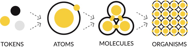
Building in phases, from the smallest decision up.
Adding a token methodology to the atomic design model let us build the system in planned phases: tokens → atoms → molecules → organisms.
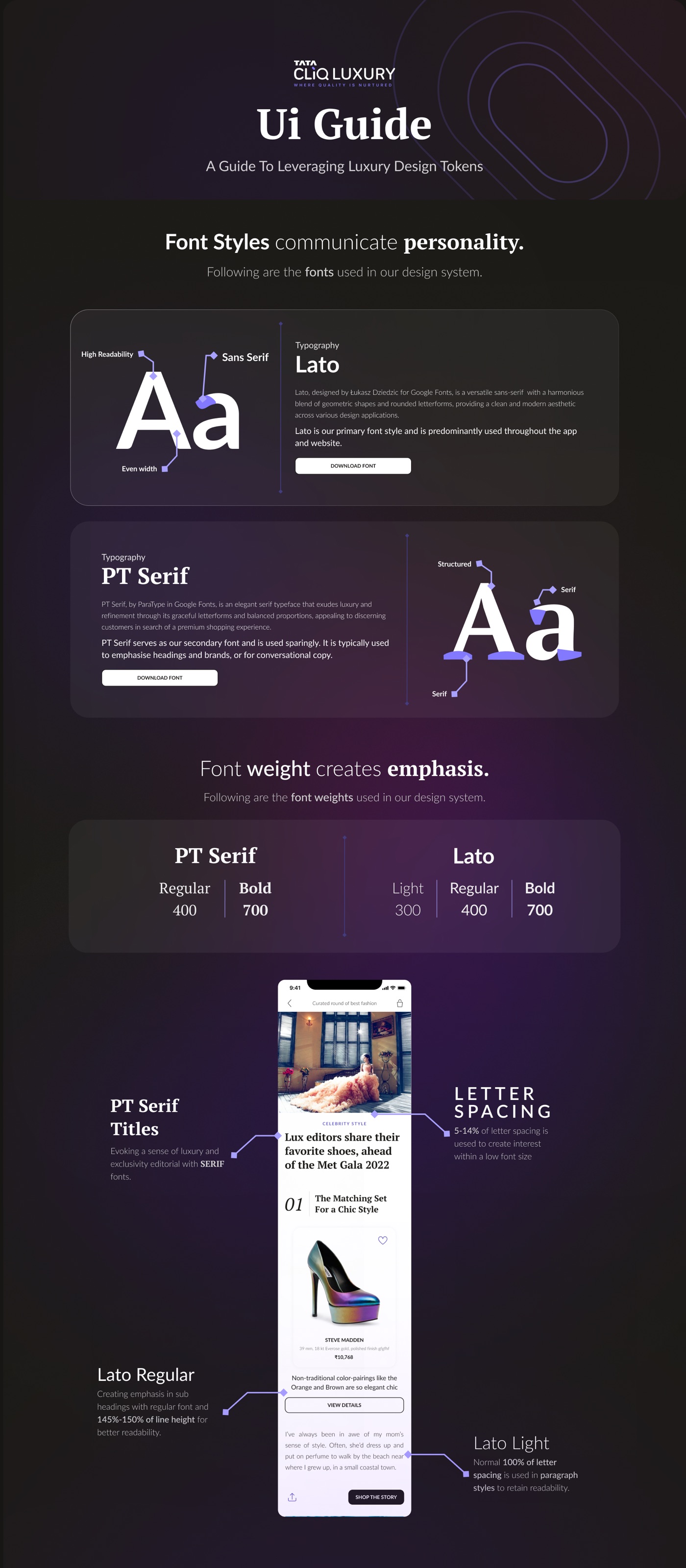
After a lot of exploration, we moved away from traditional heading names (H1, H2, H3), which couldn't scale, to a Small, Medium, Large system that grew with the product.
We also kept separate type styles for desktop and mobile. That naming paid off later: when we built the luxury editorial experience, which needed very different typography from the product, listing and checkout journeys, the system stretched to it without being renamed.
Fig. 5 · The type scale, with serif for storytelling and sans for everything functional. Shown here in this site's typefaces.
Named by scale, not position
Small to 5X Large instead of H1 to H6, so any new surface can pick sizes without renaming everything.
An averaged golden ratio
12 · 14 · 16 · 18 · 20 · 24 · 32. Each step grows by a near-constant ratio, rounded to sizes that render crisply.
Skip a level for hierarchy
A heading and its body never sit on neighbouring steps, so the contrast between them is always clear.
The highlight of this phase was a set of versatile text atoms, the building block behind everything from CTAs to editorial headings. To keep components modular, we developed a method that got the most out of auto layout without the complexity it often brings: simple booleans and dynamic spacing.
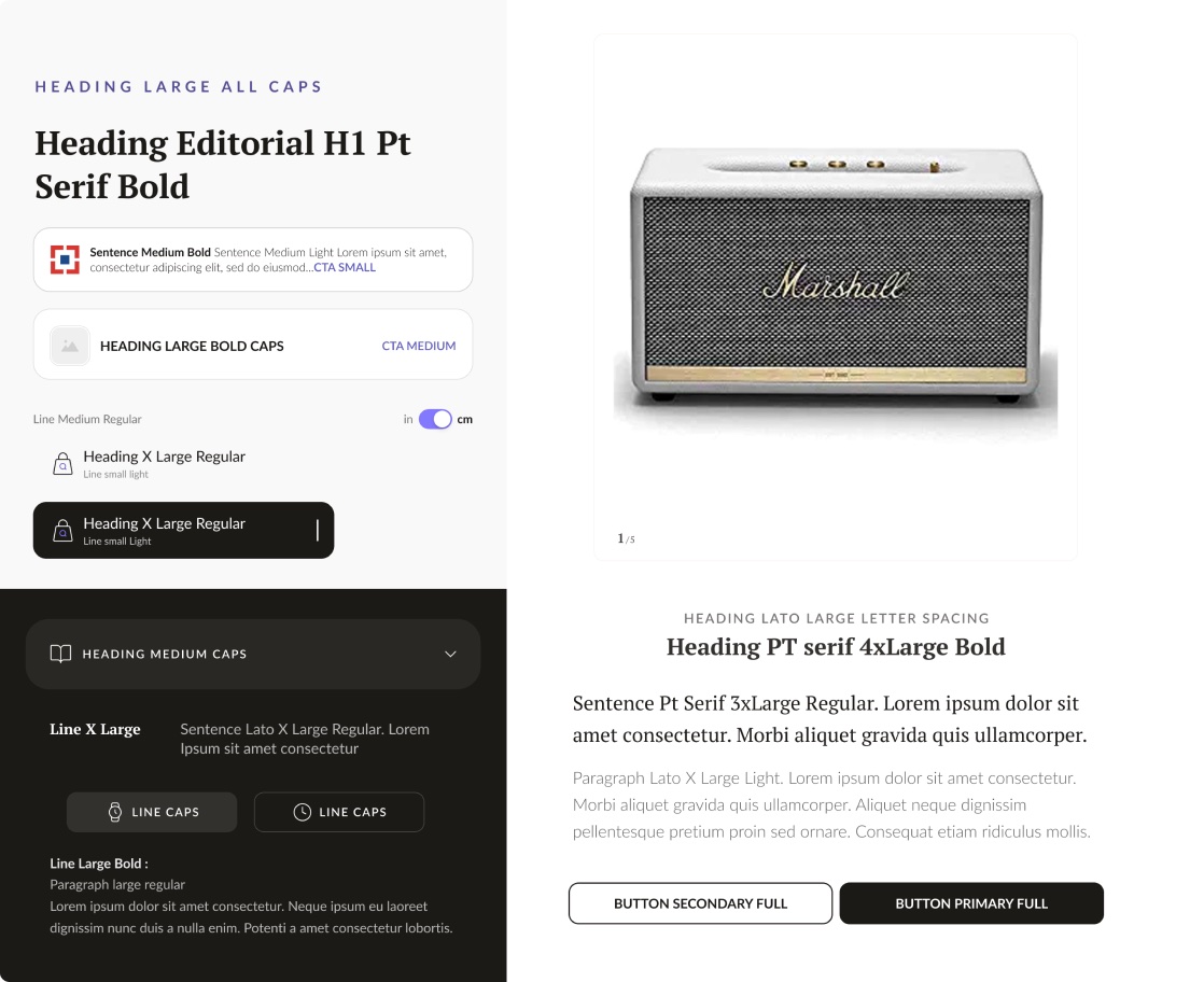
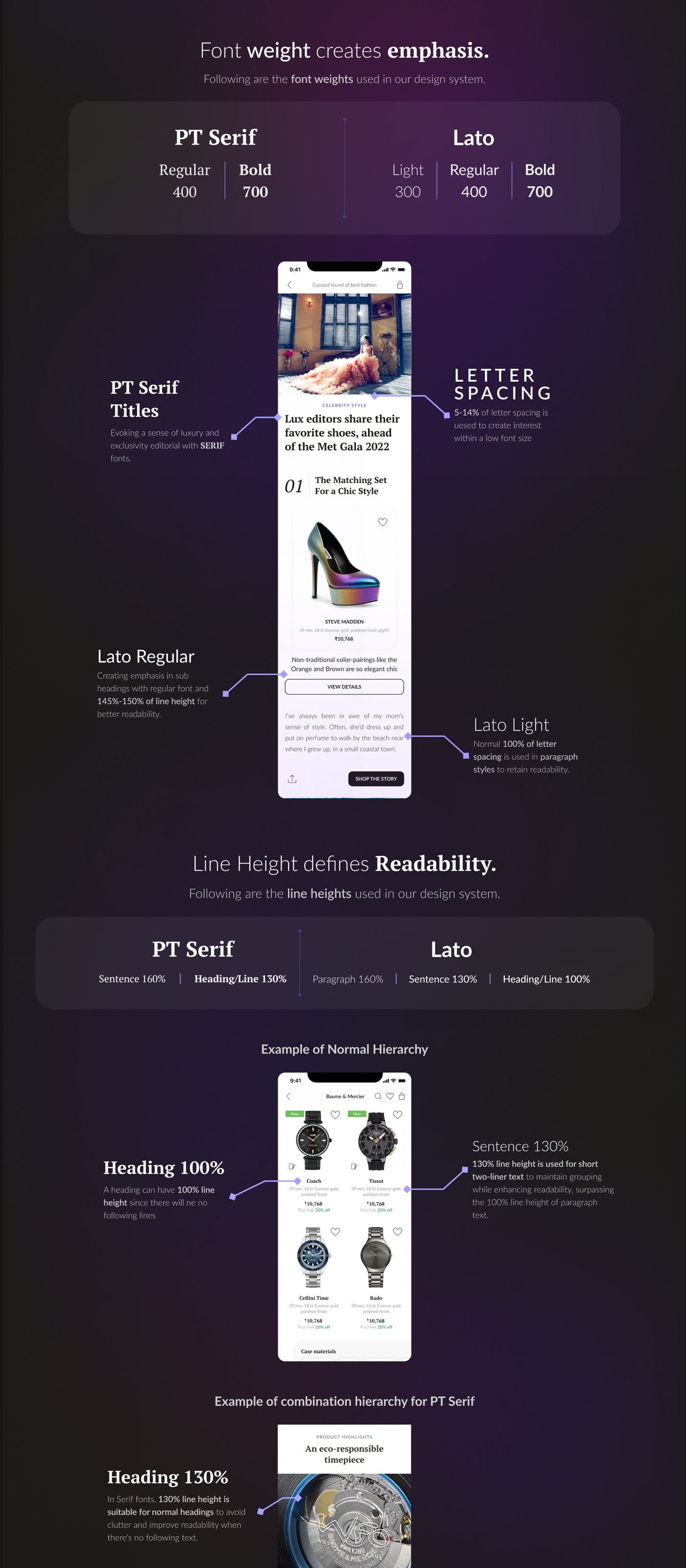
Emotion, specified down to the line-height.
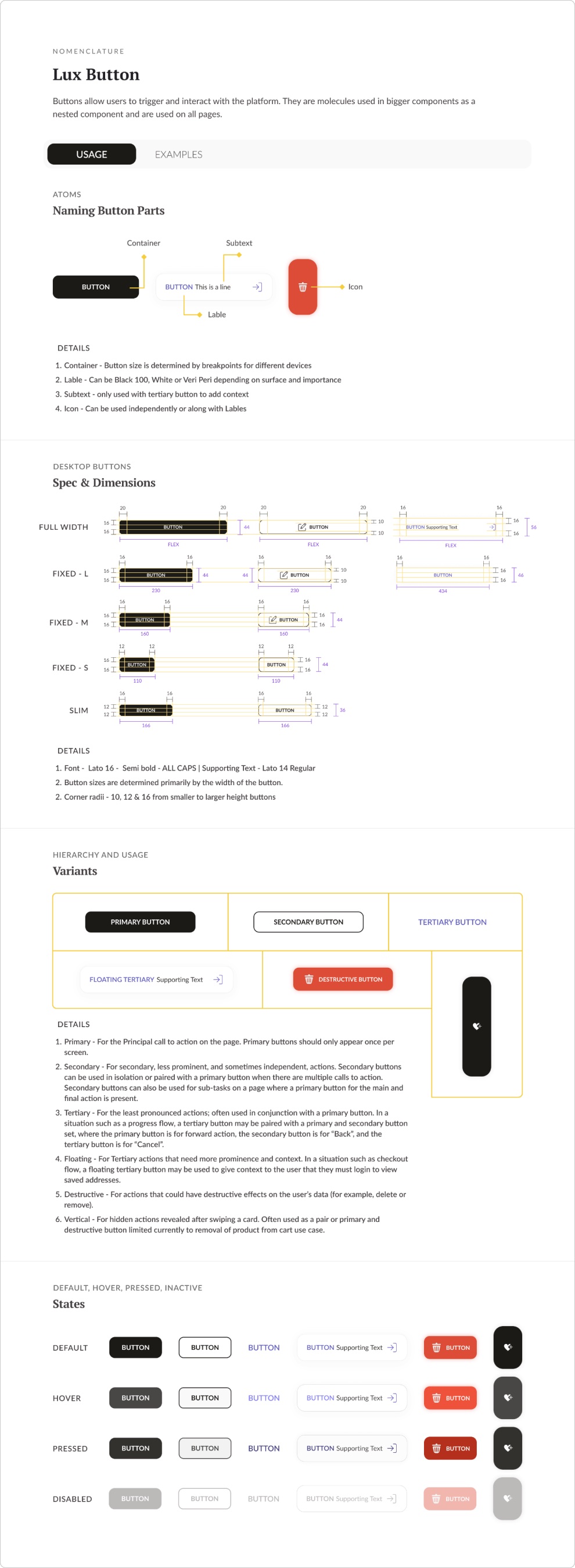
Next came detailed documentation for every element, starting with tokens. Each entry covers variants, usage guidelines and real examples, so anyone can apply the same rule the same way.
Rebuilding the library, not just moving it.
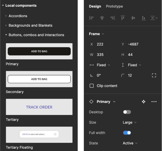
A key part of the project was rebuilding the old Sketch library in Figma with the new design language built in. It took careful planning and a restructure of both components and naming, so the library kept its atomic structure and stayed easy for designers and developers to use.
A system only works if it ships the way it was designed.
There were setbacks. At first, developers interpreted components differently from how we'd designed them, which undermined the consistency we were after. So we sat with the dev team to understand their constraints and learn to communicate better.
We solved it iteratively. We refined the documentation, tokens and naming to fit how developers work, and set up a continuous two-way feedback loop so designs came to life as intended.
The foundation of a digital identity.
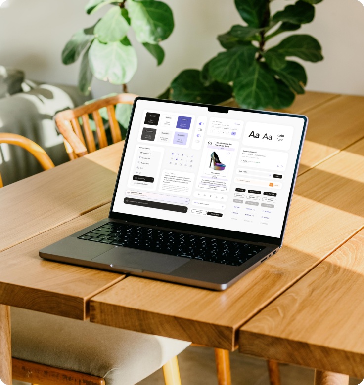
The design system became the foundation of Tata CLiQ Luxury's digital identity. All the tokens went live, and more components are added every sprint. It was designed to extend to Fashion and Palette too; that roll-out is still under way.
We delivered a scalable, modular, consistent system while still meeting product requirements, and we did it as the smallest design team in the organisation.
Key contributions
- Aarti Kava: Vision, strategy & design system creation
- Aryan Kandhari: Design system creation
- Anaya Purandare: Visual documentation
- With Naman Jain (iOS developer) and Akshay Garg (iOS lead developer)